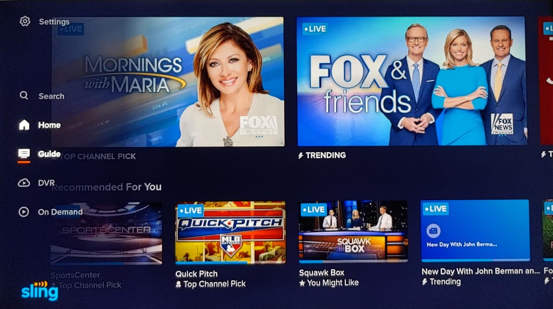
Sling TV's new look has a side-mounted menu and larger thumbnails.
Ty Pendlebury/CNETSling TV has unveiled a slick new interface for its live TV streaming service, which includes a new DVR menu option and a smart search feature. In my hands-on experience with the new menus, I liked it much better than the current version. It's sleeker-looking, more modern and best of all, easier to use.
The new menu system rolls out to the Sling TV app on Amazon Fire TV devices first, starting Tuesday, and will continue throughout the year, with Roku devices slated to get the update this summer. Sling says it has even more features in the works for future releases.
Sling TV has been CNET's favorite budget live TV streaming service ever since it debuted way back in 2015. It's available in two different flavors -- Sling TV Blue and Sling TV Orange -- and both are $35. The service enables users to cut the cord and access streaming live TV from a host of different devices, including phones, browsers and all of the popular TV streaming devices. Sling TV Blue is our CNET Editors' Choice for budget streaming service, and makes an excellent option for people who want a healthy selection of live channels but don't want to pay $65 for something like YouTube TV.
Read more: Hulu vs. YouTube TV vs. Sling TV vs. AT&T TV vs. Philo vs. FuboTV: 100 channels compared

The new guide makes favoriting and recording easier.
Ty Pendlebury/CNETDespite the entrance (and exit) of numerous competitors, Sling TV has steadfastly held onto its position as a popular budget service. But there's been another constant -- it's always looked cheap. Put simply, its current interface isn't great, and has been due for an overhaul for years.
I've been using Sling TV's new interface for a few days and can confirm it brings the product firmly up to date. On the Fire TV Stick 4K I tested, it's a streamlined experience with fast navigation and plenty of eye-candy.

The current version has a horizontal main menu at the top, while the update changes that to a cut-down menu at the side with fewer, simpler selections. The options from top to bottom are: Settings, Search, Home, Guide, DVR and On Demand. The previous breakouts into TV, Movies and Sports have been removed, making the interface clearer and easier to use.
The redesigned homepage also offers larger thumbnails of recommended shows than before, plus a pared-down guide with the ability to record to the cloud DVR straight from the grid (with one press of the Fire TV menu button). The guide is also able to be sorted by channel name, and you can add favorite channels to the left.

The updated interface appears on Fire TV devices from today.
AmazonWhen you're watching a show, the interface offers a "recent channels" pop-up that lets you toggle easily between your most-used channels. Unlike AT&T TV and its wait of up to 10 seconds when flipping between channels, I found that selecting one of the five previous channels in Sling took only a second. Surfing channels up and down the dial may not be possible as it is with AT&T, but I'd take super fast channel changes any day.
The search page is also easier to use, although I found the onscreen keyboard a bit small and clunky. The page now includes a list of previous searches, plus an autofill feature that shows results as you type.
What do the changes mean for the future of Sling TV? While it's too early to tell, first impressions are promising. The interface is cleaner, it's easier to perform tasks like recording TV and it simply feels like a more complete product. Expect to see an update of our Sling TV review with the new additions soon.
"easy" - Google News
May 25, 2021 at 09:00PM
https://ift.tt/3oQhtvH
Sling TV's new, easy-to-use menus make cord-cutting more fun: Hands-on - CNET
"easy" - Google News
https://ift.tt/38z63U6
Shoes Man Tutorial
Pos News Update
Meme Update
Korean Entertainment News
Japan News Update
Bagikan Berita Ini


0 Response to "Sling TV's new, easy-to-use menus make cord-cutting more fun: Hands-on - CNET"
Post a Comment