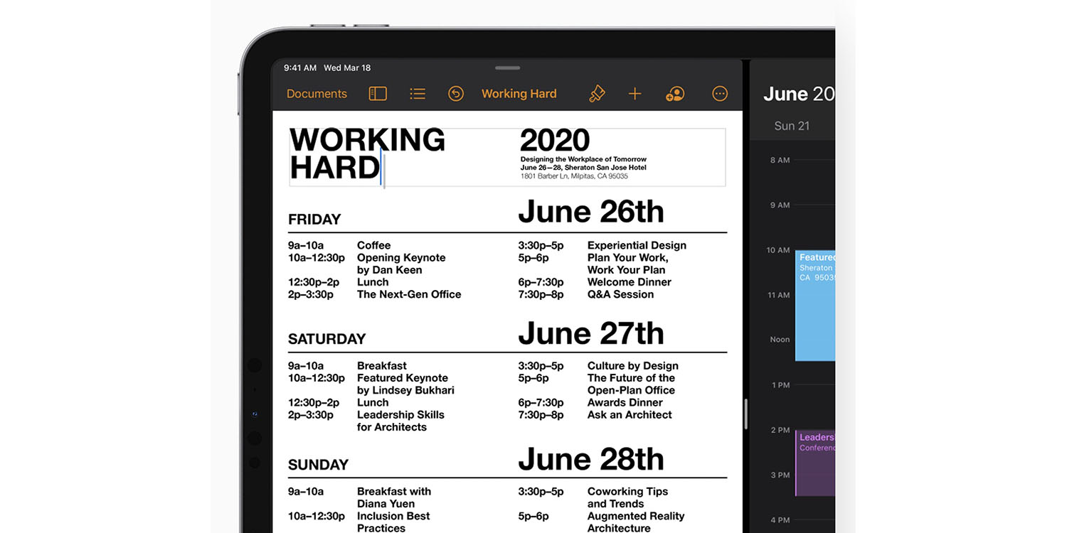
Creating the iPadOS cursor without compromising the touch-first nature of the iPad was no easy task, says Apple SVP Craig Federighi in a new interview.
He says that the project leaned significantly on what the company had learned from Apple TV …
TechCrunch’s Matthew Panzarino interviewed Federighi.
If you’ve noticed some similarities between the way that the cursor behaves on iPad OS and the way it works on Apple TV, you’re not alone. There is the familiar ‘jumping’ from one point of interest to another, for instance, and the slight sheen of a button as you move your finger while ‘hovering’ on it.
“There was a process to figure out exactly how various elements would work together,” Federighi says. “We knew we wanted a very touch-centric cursor that was not conveying an unnecessary level of precision. We knew we had a focus experience similar to Apple TV that we could take advantage of in a delightful way. We knew that when dealing with text we wanted to provide a greater sense of feedback.”
“Part of what I love so much about what’s happened with iPadOS is the way that we’ve drawn from so many sources. The experience draws from our work on tvOS, from years of work on the Mac, and from the origins of iPhone X and early iPad, creating something new that feels really natural for iPad.”
And the Apple TV interface didn’t just ‘inspire’ the cursor — the core design team responsible works across groups, including the Apple TV, iPad OS and other products.
The approach taken for the iPadOS cursor was about emulating a finger touch most of the time, but allowing Mac-like precision when editing text.
“When we were first thinking about the cursor, we needed it to reflect the natural and easy experience of using your finger when high precision isn’t necessary, like when accessing an icon on the home screen, but it also needed to scale very naturally into high precision tasks like editing text,” says Federighi.
“So we came up with a circle that elegantly transforms to accomplish the task at hand. For example, it morphs to become the focus around a button, or to hop over to another button, or it morphs into something more precise when that makes sense, like the I-beam for text selection“ […]
The I-Beam [matches] the size of the text you’re editing, to make it abundantly clear where the cursor will insert and what size of text it will produce when you begin typing.
The whole piece, including a historical perspective on the cursor, is well worth a read.
FTC: We use income earning auto affiliate links. More.
Check out 9to5Mac on YouTube for more Apple news:
"easy" - Google News
May 06, 2020 at 09:11PM
https://ift.tt/2SGdp2h
Creating the iPadOS cursor wasn’t easy, says Apple SVP Craig Federighi - 9to5Mac
"easy" - Google News
https://ift.tt/38z63U6
Shoes Man Tutorial
Pos News Update
Meme Update
Korean Entertainment News
Japan News Update
Bagikan Berita Ini


0 Response to "Creating the iPadOS cursor wasn’t easy, says Apple SVP Craig Federighi - 9to5Mac"
Post a Comment