Another option for agents and marketing staff looking to bring their design in-house, this web-based marketing resource provides creative cues, just enough brand control and plenty of value.
Have suggestions for products that you’d like to see reviewed by our real estate technology expert? Email Craig Rowe.
RelayThat is a web-based visual design and marketing solution.
Platforms: Browser
Ideal for: All agents, teams and brokerages
Top selling points
- Deep template library
- Brand asset controls
- General ease of use
- Recommended color and font pairings
- Cross-collateral editing
Top concerns
While easy for agents to use, this is still software best delegated to marketing staff. Its wide array of fonts, images and color choices could lead nondesigners into creative purgatory.
What you should know
If you (or your brokerage) haven’t yet canceled your Adobe Creative Suite subscription, rest assured it’s past time to do so.
Between design offerings like LucidPress, Jigglar, Studeo, Canva, AgentIcon and now, RelayThat, real estate offices have little need for high-end tools of the professional graphic designer. The template-driven, affordable options are too many to justify the marketing spend or hours of training.
RelayThat has only recently entered the real estate halo, but it’s not kidding around about wanting to stay within its sheen.

I was told a couple of notable CRMs had asked RelayThat about integrations, serving as the impetus for the company’s focus on the needs of agents.
The company is currently in talks with more than 200 boards and will soon have an IDX feed up and running so property content can flow easily into its array of marketing collateral templates.

It will also soon launch its enterprise-level offering as an appeal to the branding teams at large national brokerages.
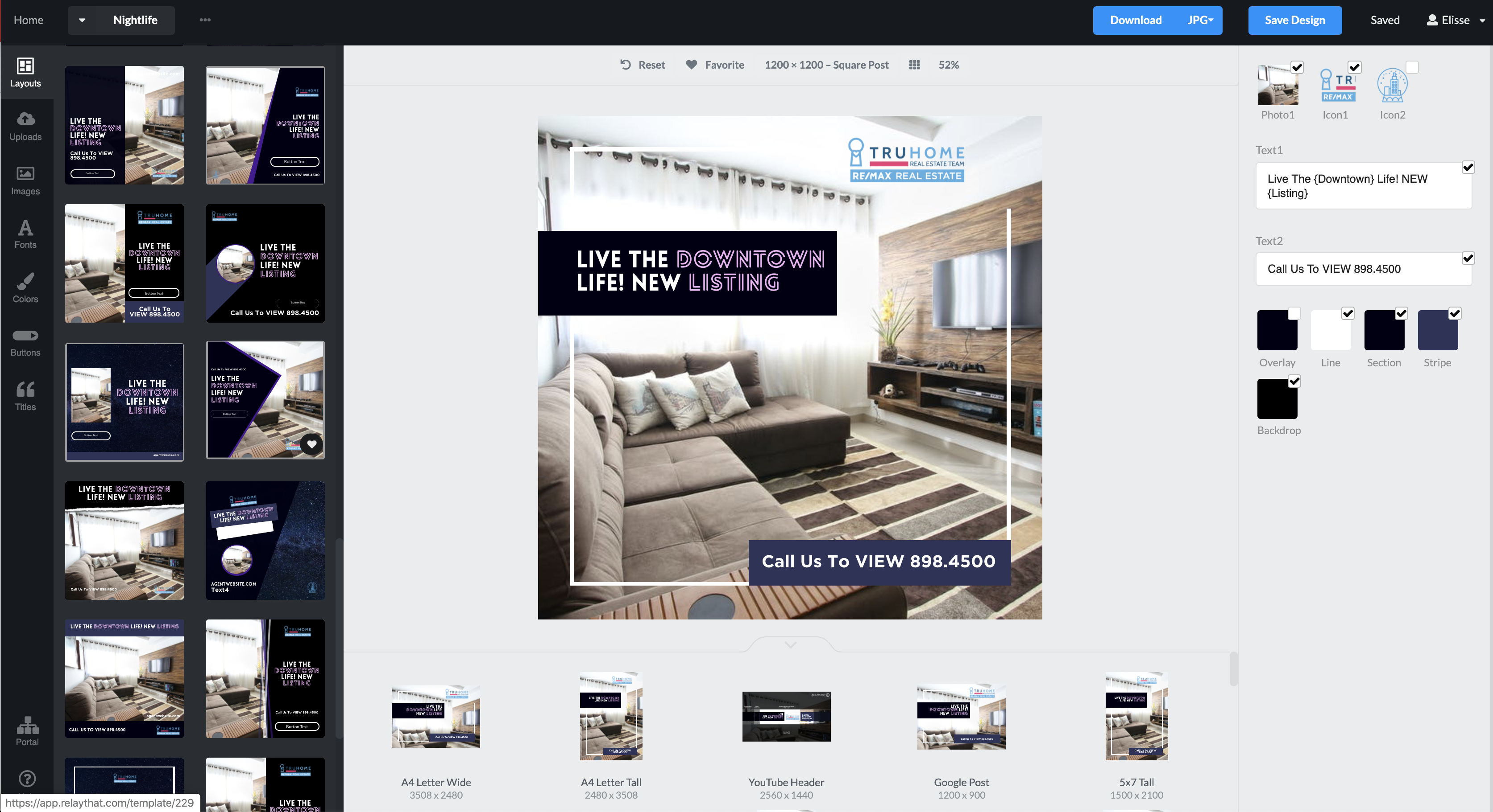
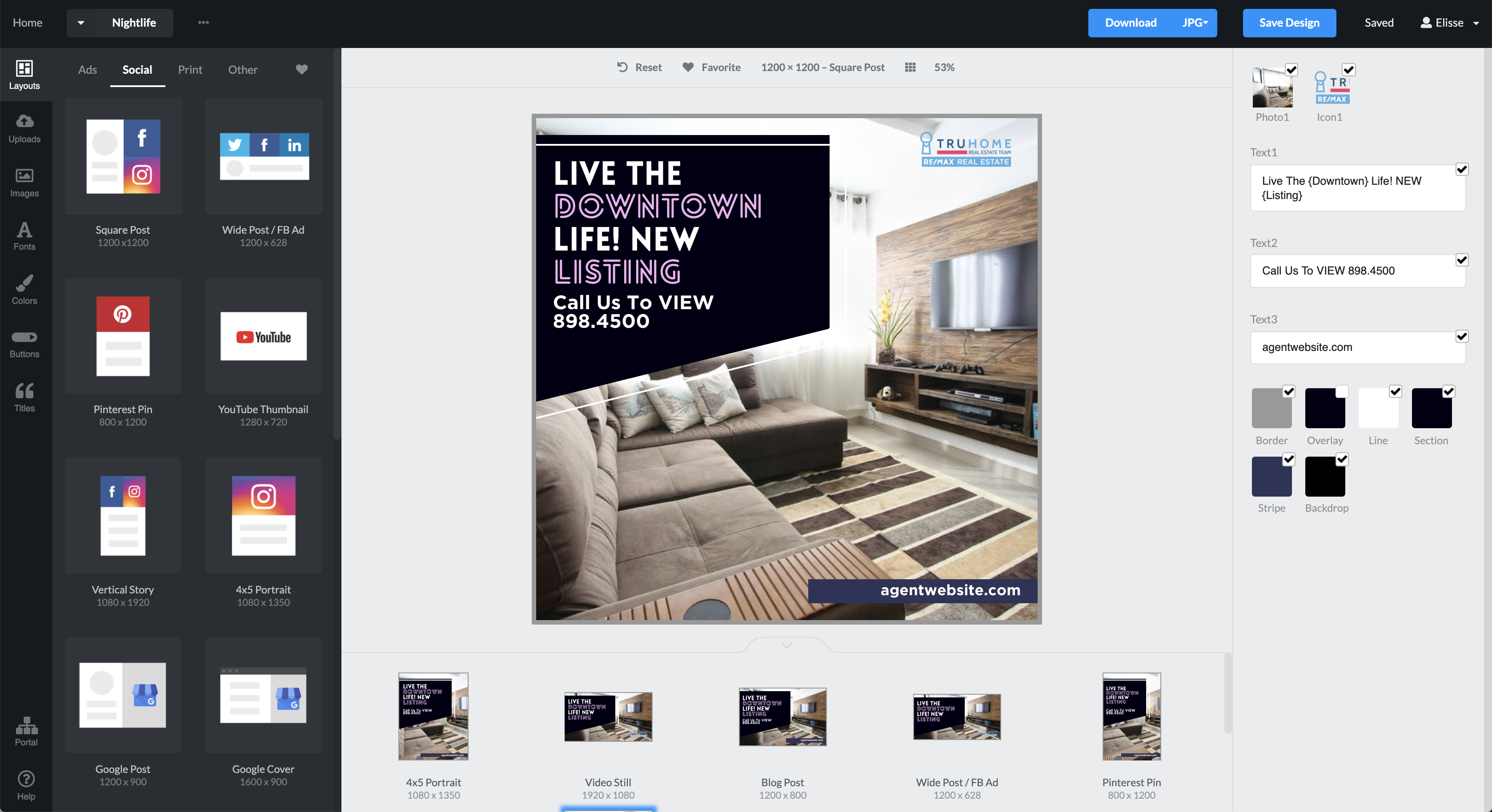
Similar to others in its ilk, RelayThat allows nondesigners to create everything from Facebook page covers to trifold prints and even posts tailor-made for Reddit. An account includes an immense stock image library, more fonts than you’ll need and some sharp productivity features that make it worth your creative consideration.
To alleviate the risk of using poor color combinations, the software has a number of pre-combined color sets. And even more importantly — and mercifully — it does the same for fonts. (Please, for the sake of the industry, trust their recommendations.)
RelayThat also offers copy cues, a number of saved slogans and property terms to use as creative catalysts or simply for the sake of quick turnaround. This adds terrific value for brokerage brand managers.
RelayThat doesn’t exhibit the type of “total-lockdown” asset control that comes with LucidPress.
I suspect that will come if the company finds itself entrenched in the marketing offices of some of the bigger-name homesellers, as per its goals. It certainly has the technical chops to do so. It merely lacks the real estate business tenure to know how crucial brand oversight is to the industry gorillas.

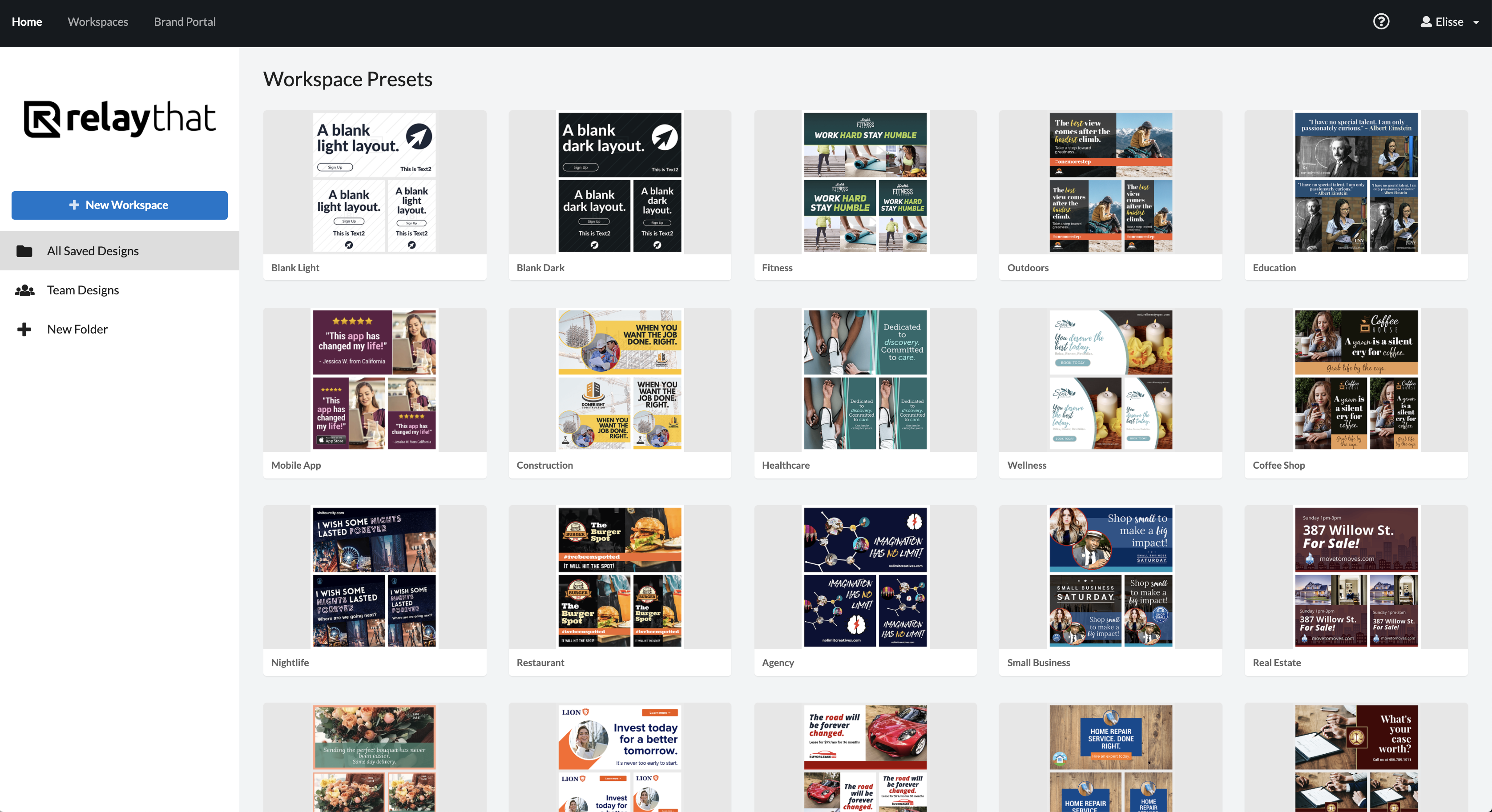
What it does offer in its Workspaces is a Team Designs folder and Brand Portal for saving everything from logos and links to headshots and yard signs. Access to files can be monitored, color combos saved and font choices secured.
Again, while I didn’t see the level of management here that LucidPress brings, there’s enough control to allow brand managers to wake up refreshed.
The software boasts a couple of other very sharp tools that give me enough confidence to say RelayThat’s rapid rise into the ranks of preferred real estate marketing tools will be justified.
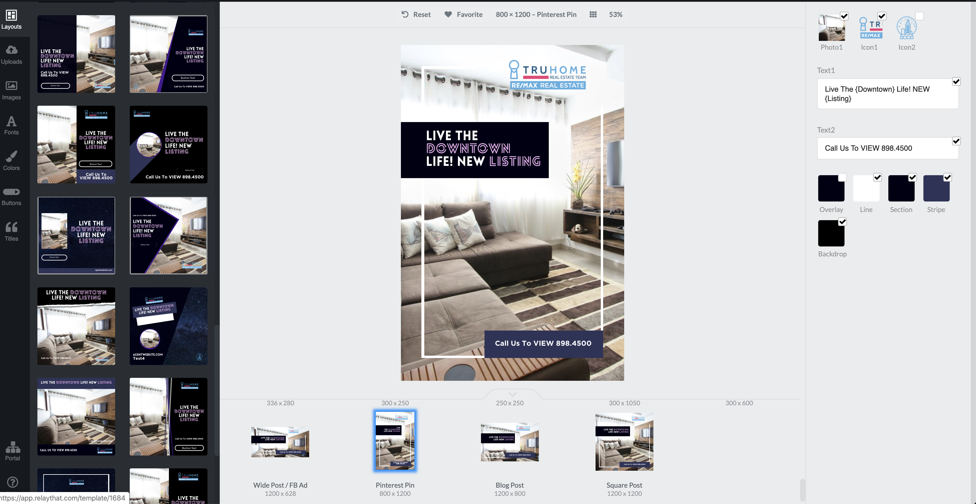
If you have a series of related collateral — postcard, listing flyer, Instagram post — you need only edit one to have the change be reflected in each. Sharp.

The MagicImport feature isn’t something I’ve seen before.
Enter a URL, and the tool scrapes the website for pictures, colors, logos and any other (legally shareable) visual elements for saving into an asset library. This can be used to ensure color consistency, grab web-safe logos, and reuse web elements for other online needs, such as banner ads and social content.
The design experience is pretty easy, with lots of familiar ways to drag and drop, scale, and alter colors and fonts.
Still, despite the low learning curve and efficiency-driven user experience, its value will be most realized by letting your marketing teams leverage the benefits. They’ll be able to do more in less time and most to the point, it’ll look better.
Have a technology product you would like to discuss? Email Craig Rowe
Craig C. Rowe started in commercial real estate at the dawn of the dot-com boom, helping an array of commercial real estate companies fortify their online presence and analyze internal software decisions. He now helps agents with technology decisions and marketing through reviewing software and tech for Inman. He lives near Lake Tahoe in the northern Sierra Nevada of California.
"easy" - Google News
June 26, 2020 at 04:00PM
https://ift.tt/2Z6jffW
Bring Your Design In-House With RelayThat's Easy-To-Use Tools - Inman
"easy" - Google News
https://ift.tt/38z63U6
Shoes Man Tutorial
Pos News Update
Meme Update
Korean Entertainment News
Japan News Update
Bagikan Berita Ini


0 Response to "Bring Your Design In-House With RelayThat's Easy-To-Use Tools - Inman"
Post a Comment